How it works
In this notebook we learn how the stissplice code works in more detail. We start by importing the necessary packages.
[1]:
import matplotlib.pyplot as plt
import matplotlib.pylab as pylab
from stissplice import splicer, tools
import numpy as np

# Uncomment the next line if you have a MacBook with retina screen
# %config InlineBackend.figure_format = 'retina'
pylab.rcParams['figure.figsize'] = 13.0,6.5
pylab.rcParams['font.size'] = 18
Matplotlib is building the font cache; this may take a moment.
The workhorse of stissplice is the splice_pipeline() function. Here’s how it works, step by step.
Read an
_x1dspectrum usingsplicer.read_spectrum(): This code usesastropy.io.fits.open()to read a.fitsfile and extract the wavelength, flux and error arrays.
[2]:
dataset = 'oblh01040'
prefix = '../../data/'

spectrum = splicer.read_spectrum(dataset, prefix)
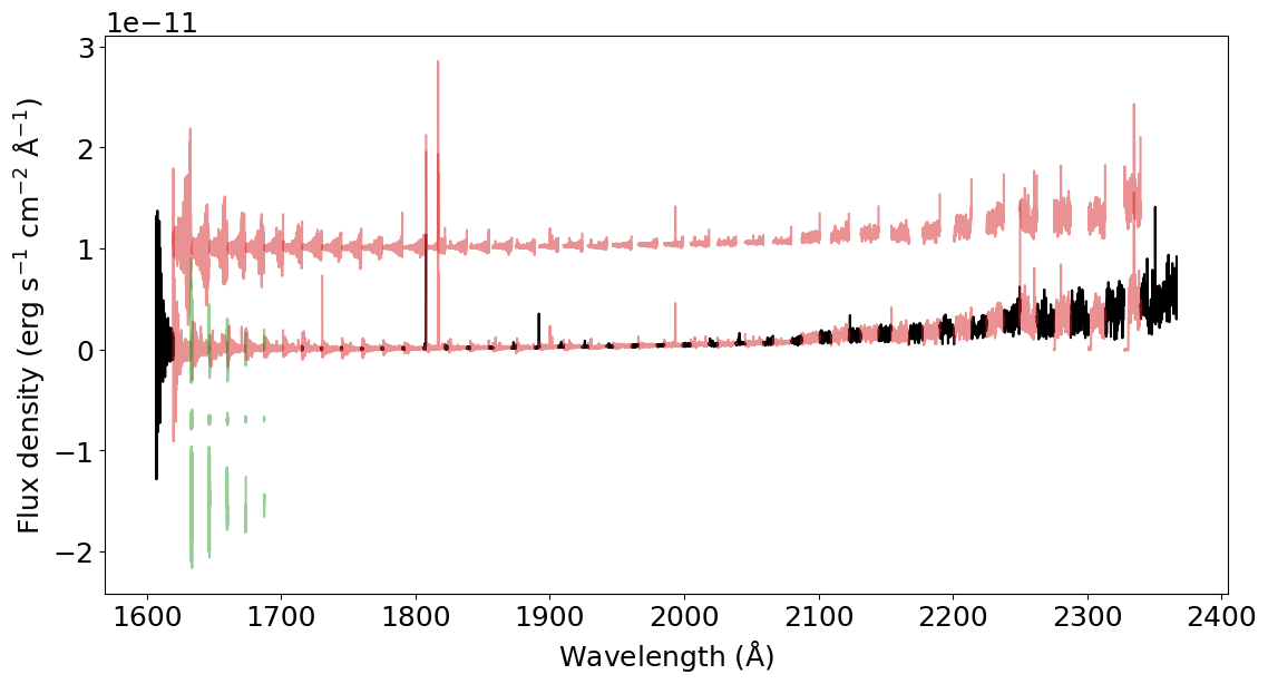
Find the overlap between the different spectral orders using
splicer.find_overlap(): This code identifies the sections of the orders that are either unique (no overlap with any order) or that overlap once or twice with other orders. This function returns the variablesunique_sections,overlap_pair_sections,overlap_trio_sections.
In the plot below, black represents the unique sections. Red represents sections that are double overlaps (one of them is shifted in the y-axis for clarity purposes). And green represents the sections in triple overlaps (two of them shifted for clarity).
[3]:
unique_sections, overlap_pair_sections, overlap_trio_sections = splicer.find_overlap(spectrum)

for us in unique_sections:
    plt.plot(us['wavelength'], us['flux'], color='k')

for ops in overlap_pair_sections:
    plt.plot(ops[0]['wavelength'], ops[0]['flux'], color='C3', alpha=0.5)
    plt.plot(ops[1]['wavelength'], ops[1]['flux'] + 1.0E-11, color='C3', alpha=0.5)

for ots in overlap_trio_sections:
    plt.plot(ots[0]['wavelength'], ots[0]['flux'], color='C2', alpha=0.5)
    plt.plot(ots[1]['wavelength'], ots[1]['flux'] - 0.7E-11, color='C2', alpha=0.5)
    plt.plot(ots[2]['wavelength'], ots[2]['flux'] - 1.6E-11, color='C2', alpha=0.5)

_ = plt.xlabel(r'Wavelength (${\rm \AA}$)')
_ = plt.ylabel(r'Flux density (erg s$^{-1}$ cm$^{-2}$ ${\rm \AA}^{-1}$)')
Merge the overlapping sections using
splicer.merge_overlaps(): This function takes either the double or triple overlap sections calculated above, and co-add them. The co-adding process begins by finding which section has the higher SNR, and then interpolates the other sibling section(s) into the same wavelength grid as the section with the higher SNR. The sibling sections are then merged by taking the weighted-average flux and error for each pixel, where the weights are the inverse-square of the errors. The merged pixels will then be assigned a data quality flag with the value32768, which correspond to a co-added pixel. This function returns the co-added section
When co-adding pixels, the code identifies the data quality flag (DQ) of each one of them, and only co-adds pixels that have acceptable DQ flags. The user can specify which flags are acceptable. The default acceptable flags are: 0 = regular pixel, 64 = vignetted pixel, 128 = pixel in overscan region, 1024 = small blemish, 2048 = more than 30% of background pixels rejected by sigma-clipping in the data reduction.
[4]:
merged_pairs = [
    splicer.merge_overlap(overlap_pair_sections[k])
    for k in range(len(overlap_pair_sections))
]

merged_trios = [
    splicer.merge_overlap(overlap_trio_sections[k])
    for k in range(len(overlap_trio_sections))
]
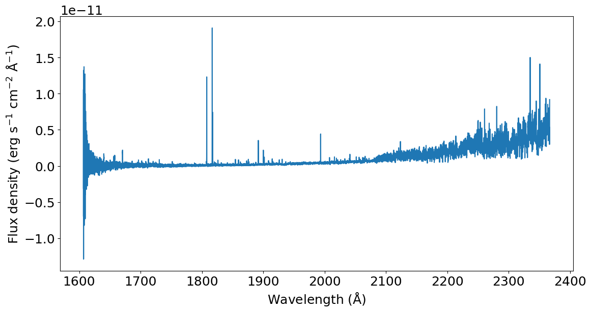
By now we have three lists: unique_sections, merged_pairs and merged_trios. The next step is to concatenate everything in the correct order using the splicer.splice() function.
[5]:
wavelength, flux, uncertainty, dq = splicer.splice(
    unique_sections, merged_pairs, merged_trios)

# Plot the spliced spectrum
plt.plot(wavelength, flux)
_ = plt.xlabel(r'Wavelength (${\rm \AA}$)')
_ = plt.ylabel(r'Flux density (erg s$^{-1}$ cm$^{-2}$ ${\rm \AA}^{-1}$)')
As shown in the usage example, this whole process can be executed in one line using the splicer.splice_pipeline() function.
[6]:
spliced_spectrum = splicer.splice_pipeline(dataset, prefix, )
plt.plot(spliced_spectrum['WAVELENGTH'], spliced_spectrum['FLUX'])
_ = plt.xlabel(r'Wavelength (${\rm \AA}$)')
_ = plt.ylabel(r'Flux density (erg s$^{-1}$ cm$^{-2}$ ${\rm \AA}^{-1}$)')
